It is a pleasant experience of viewing Pod 5’s design for Interactive Learning Resources. Here are some suggestions that I make about the materials.
A suggestion about adding some instruction in “Before we begin” part
This is a very good and interesting interactive part of letting students take the first step in this class. In this step, learners can know your teaching concepts about the learning environment and detailed information about design. It would be helpful and easy for students to start on the right track. You can provide a hyperlink to slido.com for easier access. And maybe there can be another slide with some screenshots to illustrates the steps you expected students to follow in slido.com.
The order of slides
It might be better to place the “welcome” part in the beginning to have a general explanation about the topic in this class and let students know about your teaching goals so that they could know better about the meaning of your first discussion activity. If you worry that it would be a little weird to move from the discussion to the teaching section suddenly, there can be a transition slide after slide four (start a discussion).
The layout for slide 10
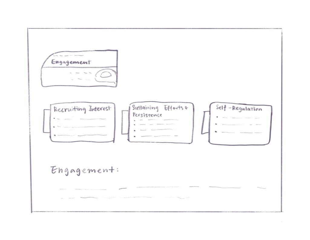
Nice image for an explanation of the universal design of learning! But there might be too much information in one slide with limited space. As an audience, I think it might be better to split the image into three parts and use one slide to show each part. Maybe it can be like this (you can take it as a reference).

The transition about Pop quiz
It is a fascinating in-class activity. However, I found there seems like a gap between the content you introduce in previous slides and this section. Students might be confused about the correlation between drawing trees with the topic they are learning. Therefore, before continuing, there can be an introduction part, like “Trying to understand ‘how to include indigenous knowledge in learning’ through practical experiences.”
Overall
I think Pod 5 has done a very good job in this Interactive Learning Resources, and many aspects remind me that we can improve our design. The knowledge about ‘inclusion in the classroom’ can be easily understood through the course materials and the resources that the instructor provided. And the class could be perfectly present to learners through over zoom. The designed activities throughout the whole class are very fun and can help students to have a better understanding of class materials. I just kind of worry that these activities might take much time for this workshop, and it might be a challenge for instructors about time management. Overall, this is an integral and excellent design with a clear structure!
Leave a Reply